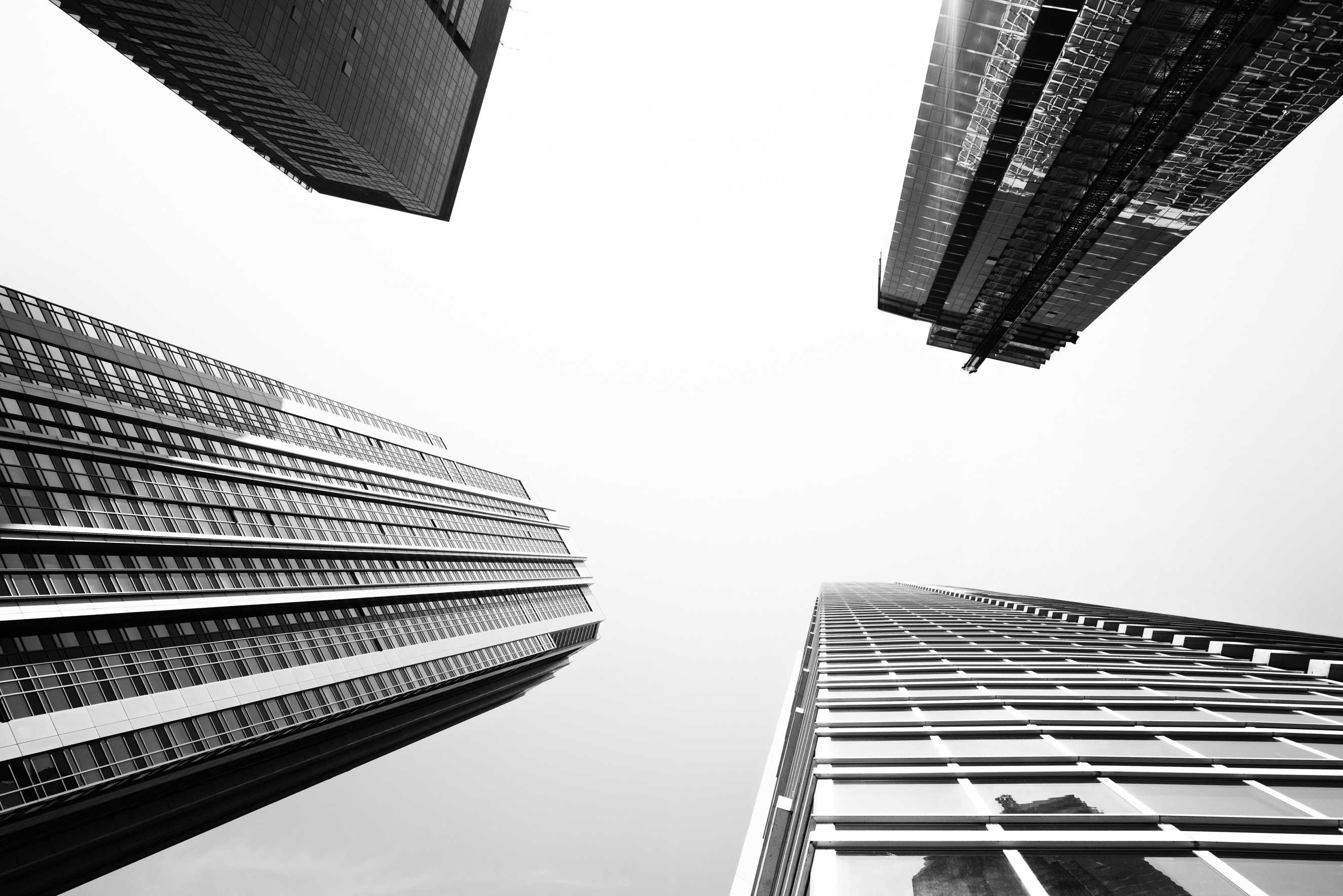
Chicago is a city of art and architecture. I don’t think thus far that I have visited a city where it is so well-integrated either. The old and the new buildings, which I will talk about in another post, and the art itself, also in an upcoming post. It all just blends so well together. It is clear the city planners know what they are doing when it comes to this “flow”. In this post I will be covering the architecture. For me, this was a study, a practice, and an adventure into the unknown. I am not good at architecture nor am I good at black and white. Though lately, I have fallen in love with both. So the photos you will see in this post, hopefully bring that love to you and demonstrate how well Chicago does this, rather than how well (or unwell) I do it. Leaving Buckingham fountain (from my last post) we head off to the streets of Chicago with no real path. All along the way Scott provides us with a wealth of knowledge, both pop culture and historical about each landmark we pass. Chicago is full of newer structures. Cold, brutal and strong. Here is an example of a block near the Lakefront trail.
Any of these photos can be purchased or licensed by clicking though on the photo. From left to right in the photo is the foreshadowing Aon Center (back left), then The Blue Cross and Blue Shield Tower, 340 on the Park, Tellin’ Tales Theater, Aqua (in the back peeking out), Outer Drive East, North Harbor Tower, and Harbor Point Condo (far right) Here is a nice transitional look from modern (right) to old (left) on the skyline.
Starting with the Crain Communications building aka the Smurfit-Stone Building on the right. Backed by the ugly Drumph tower (back right), The Heritage, The Pittsfield towering in the back, and finally the Willoughby Tower (left).
Now before you leave me any comments about buildings I left out let me just say, I was there 1 day and covered 16 miles of walking. I could have shot a week in Chicago and not gotten all the shots I wanted. And I am sure I will be back as I had a great time while there!
A message comes across from Deidre and as we stop for a nice cold one in the park she finds us. She suggests we head over to the Art Institute of Chicago. Since we are hanging at the Park Grill we decide to cut through Millennium Park to get there. Our first site on the walk is the spectacular Jay Pritzker Pavilion designed by famous architect Frank Gehry. They were setting up for a concert but I did manage to get this shot.
Gehry’s work is all through Millennium park and I will hit on that in an upcoming part of this series. Instead of using the street level entrance, Deidre takes us up Nichols Bridgeway which takes us 75ft up over the park and East Monroe Street to the upper floor of the Art Institute of Chicago. This minor change in our route results in one of my favorite shots of the day.
From the bridge, I was able to get this very cool angle of the Gehry’s design with the Aon building lined up perfectly, making it look as though the bottom of the Aon is bursting open, revealing the concert stage and seating. Scott, a one time Chicago resident, who I showed the photo to later said he had never seen it from that angle before. All of us were curious whether or not this was intentional. With the integration of art and architecture in Chicago, it would not surprise me. Intentional or not, it caught my eye and I am just happy to come away with something a little different. Thank you to Deidre Hayes for this awesome detour and for the wonderful tour of the Art Institute that she gave Danielle while us boys wandered the city. You rock!
After cramming in San Francisco, New York, and now Chicago in the past 10 months, I have come to the conclusion that this is one case where, the middle child wins. The perfect mix of old architecture, new architecture, and perfectly integrated art all come together to make Chicago an architectural heaven. There is so much here in fact that even with 3 parts of this series dedicated to it, I was barely able to touch on its vastness. In part IV I will be taking a look at the old and the new architecture of Chicago with more black and white images as well as color. Please share this story on your social networks and blogs as it helps keep my travels going as well as the site itself alive.


